Standalone share pages — v3
Five public share surfaces, rebuilt as true standalone pages, not cards on a page. The outer card wrapper is gone: content flows directly on the cool background with generous margins and hairline section separators. The hero now carries the page (large near-black name, the result visually dominant), the tables are lightened to hairline rows, the monogram avatar is replaced with a neutral photo, and the actions are confident with the sign-in framing as a quiet line.
Shared worker
Who shared it, the worker name as the hero, what it does, the tools it uses, and the most recent run shown as a proof result.
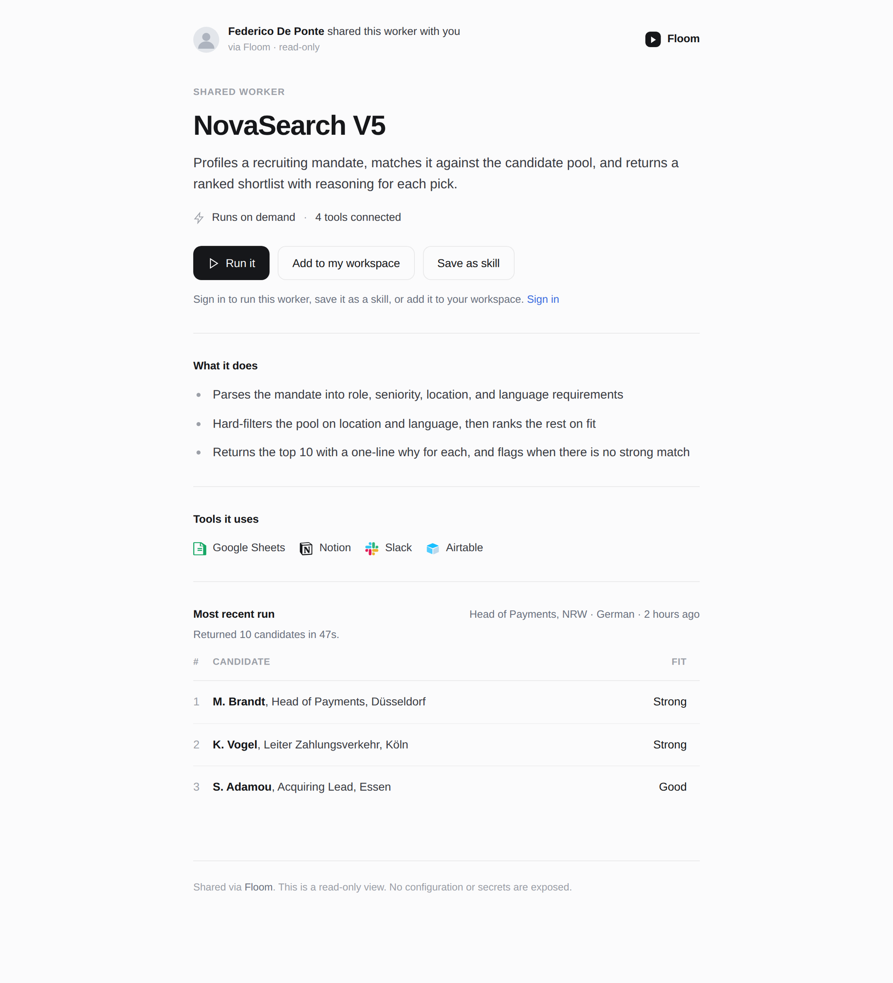
v3: dropped the outer card wrapper entirely, removed the FD monogram (neutral photo now), enlarged the name to a confident near-black hero, replaced the gray CTA box with a clean Run-it primary plus a quiet sign-in line, lightened the candidate table to hairline rows with no filled header, and turned the boxed "most recent run" into a flat section.Open
Shared run — output-first
A single run, standalone. The output is the dominant hero, flowing directly on the page; inputs are quiet below.
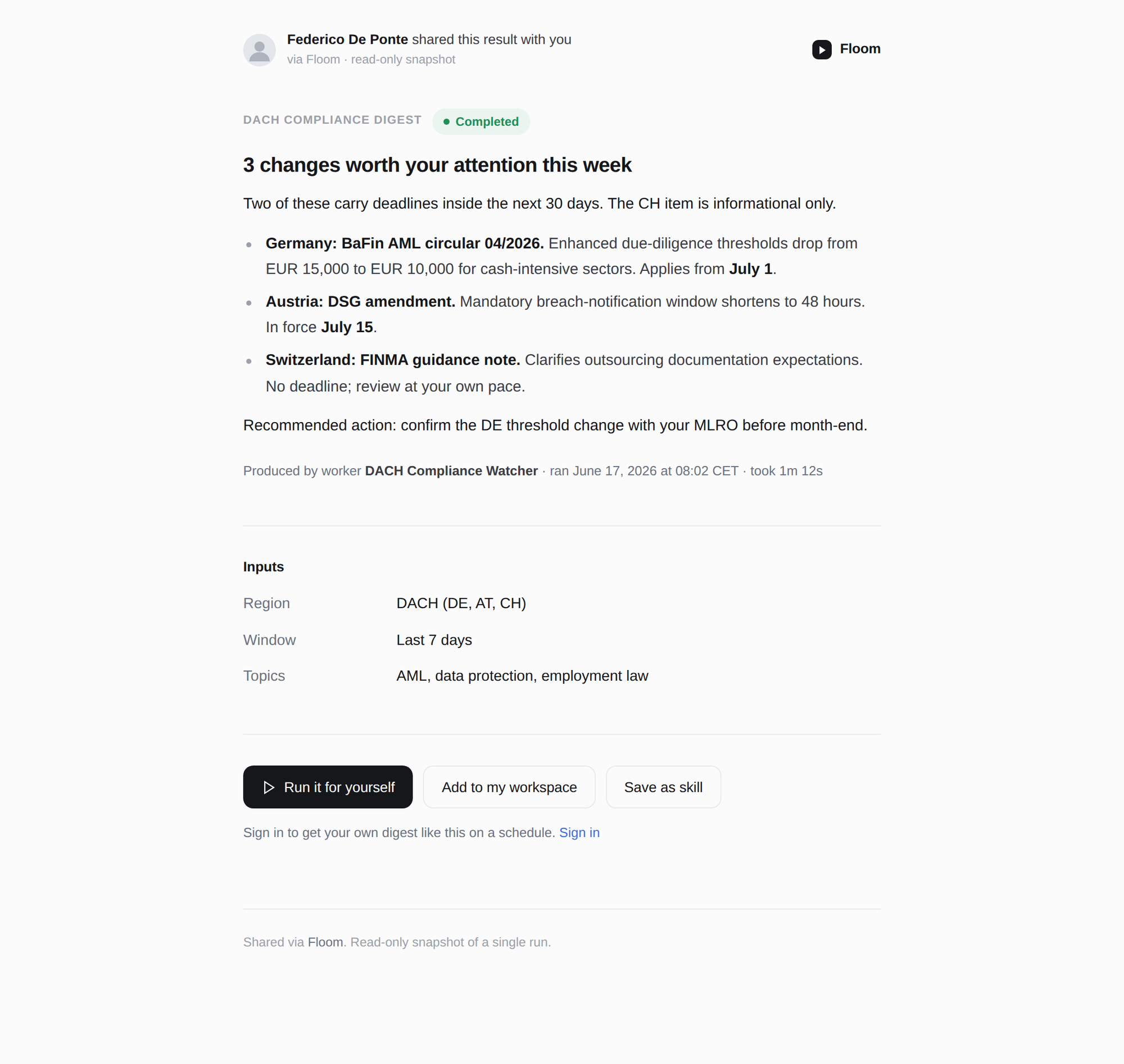
v3: the output is now the visual hero with a large headline, no inset box, flowing directly on the background. The run metadata moved to a quiet line under the output, inputs are a calm key-value list, and the CTA is confident with the sign-in framing as a quiet line.Open
Shared file — renders the file
A library file rendered standalone with a multi-item pager for one link that carries several files.
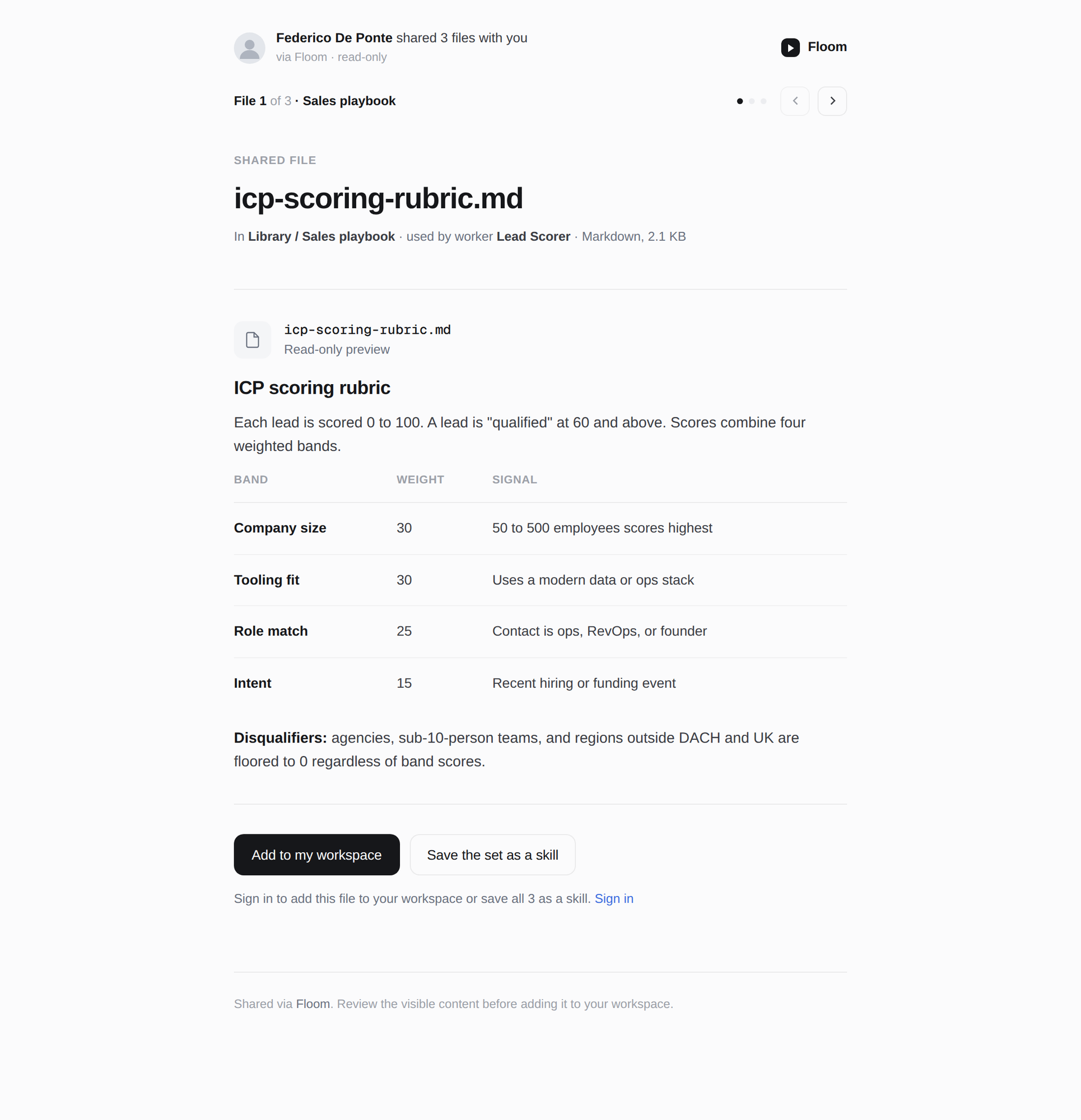
v3: the filename is the hero, the rendered file flows directly on the page with a lightened table, the pager sits on the background instead of a gray bar, and the file header lost its fill. Confident Add-to-workspace primary plus a quiet sign-in line.Open
Shared approval — input-left + pager
The recipient's response column on the left, the proposed output on the right, plus the multi-item pager.
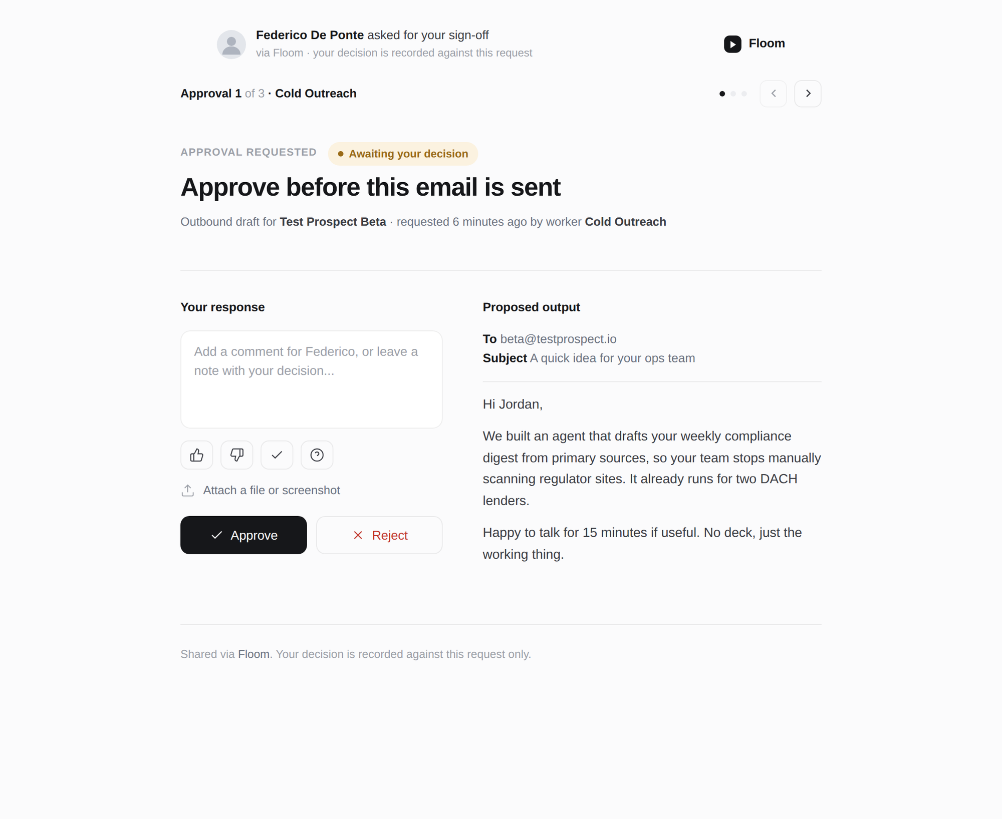
v3: the ask is now a confident hero, the proposed email renders directly on the page instead of inside a gray box, the two columns are separated by air rather than a border, and the pager sits on the background. Near-black Approve, quiet Reject.Open
Share modal — sender's side
The in-app dialog the sender uses to create the link: access list, the unlisted toggle shown enabled, copy-link, and the no-secrets note.
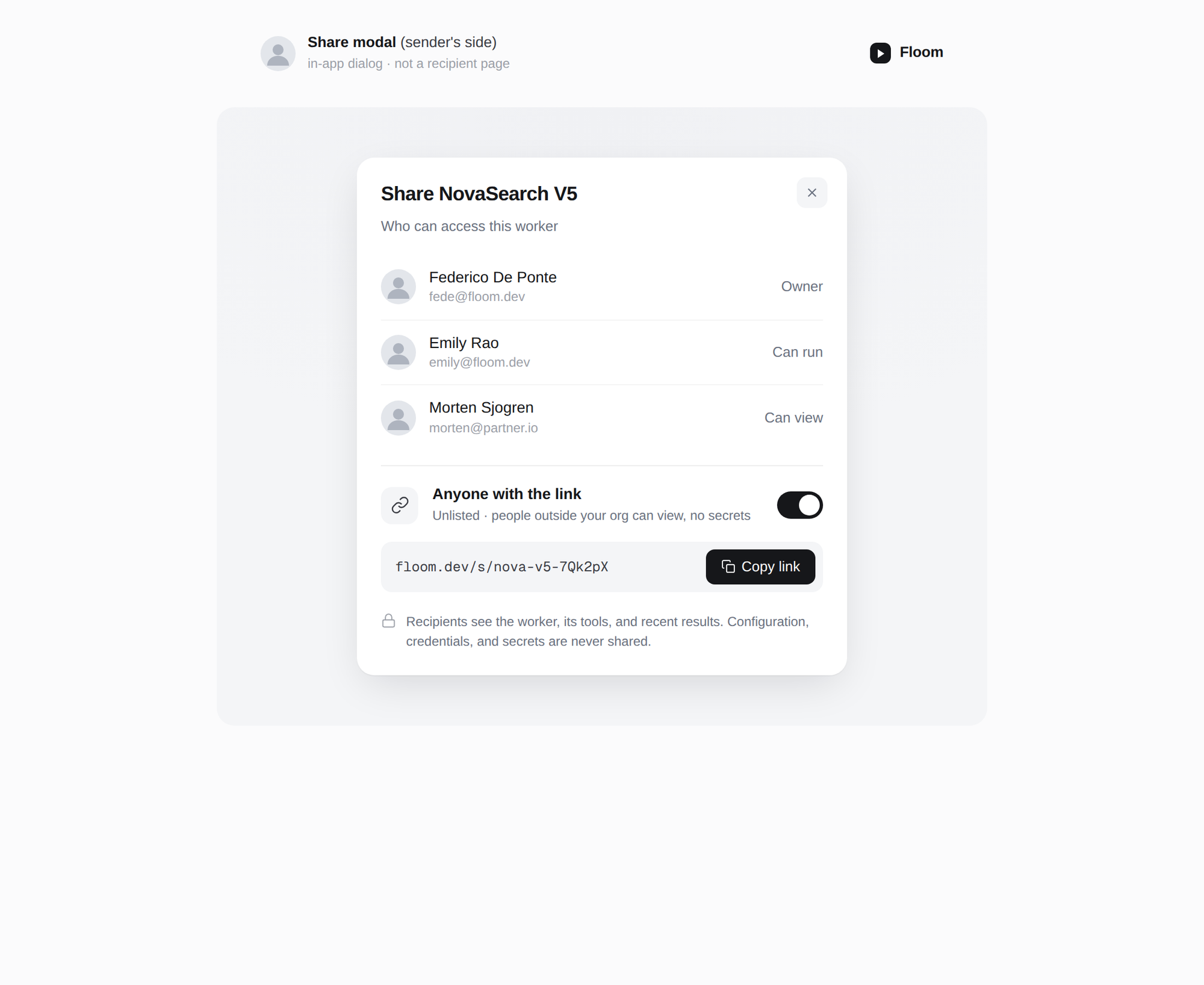
v3: monograms replaced with neutral photos, access rows separated by hairlines, and the "Anyone with the link" block divided by a hairline rule instead of a gray panel. The toggle is shown enabled; the real one ships hardcoded-disabled.Open